Dashboarding
Dashboards
Data science and analytics are interesting - but can be made more interesting through visualizations. The banner picture above by the way, is from Ne4J. I have not included too much of the use in these posts as the main purpose would be to compute degree and eigenvector values. Additionally, under “Extent of Network” section below we have queried this data using py2neo v3 and was able to pull n4j database from our notebook. You can check out my github for more details!
Enter dashboarding.
While this is a work in progress, as part of the deliverables (to myself) it is definitely worth while to create tools to enable dashboards. Eventually, I strive to host this online just so that we can play around with various variables.
Dashboards should serve a purpose and in our case, it should illustrate what is going on with a particular individual. There are a number of key questions we would like to answer just by calling a user/user ID (uuid).
1) Who does this person communicate with?
2) How many messages does this person send/receive
- Overall
- By topic
3) What are the topics discussed by this person or email, over time?
These questions would help elucidate accordingly:
1) The extent of their network.
2) Their time spent collaborating (number of items in vs out)
3) Their domain knowledge or area of discussion.
4) Identify possible issues that may arise over time.
I was going to paste some code here, but decided they are just way too long. Github has the detail for further examination. Instead, I would discuss these 4 queries and highlight key points for each of them.
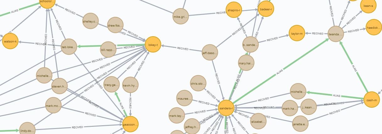
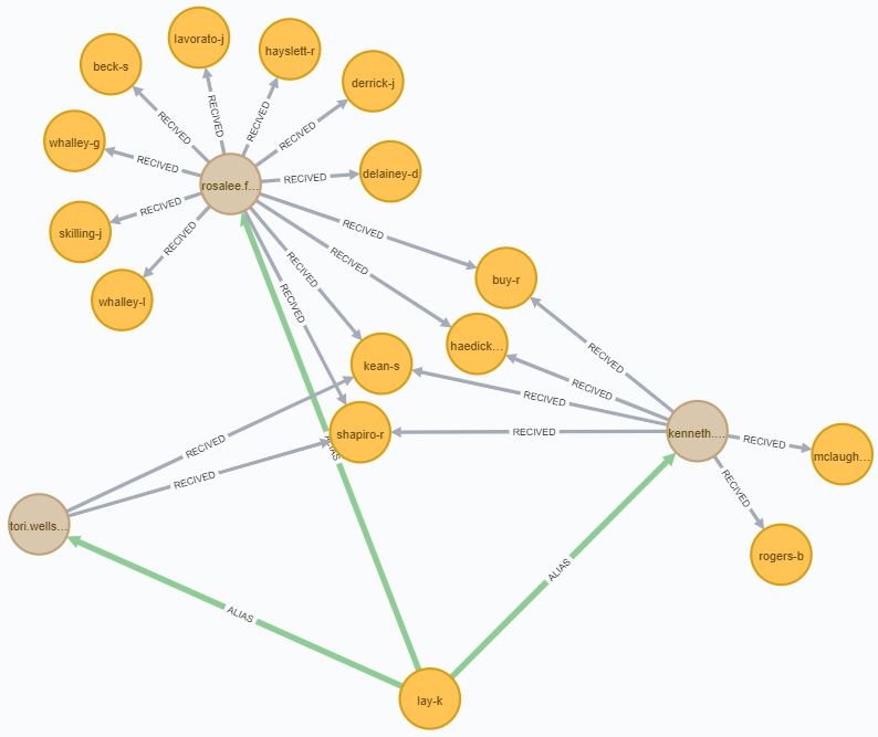
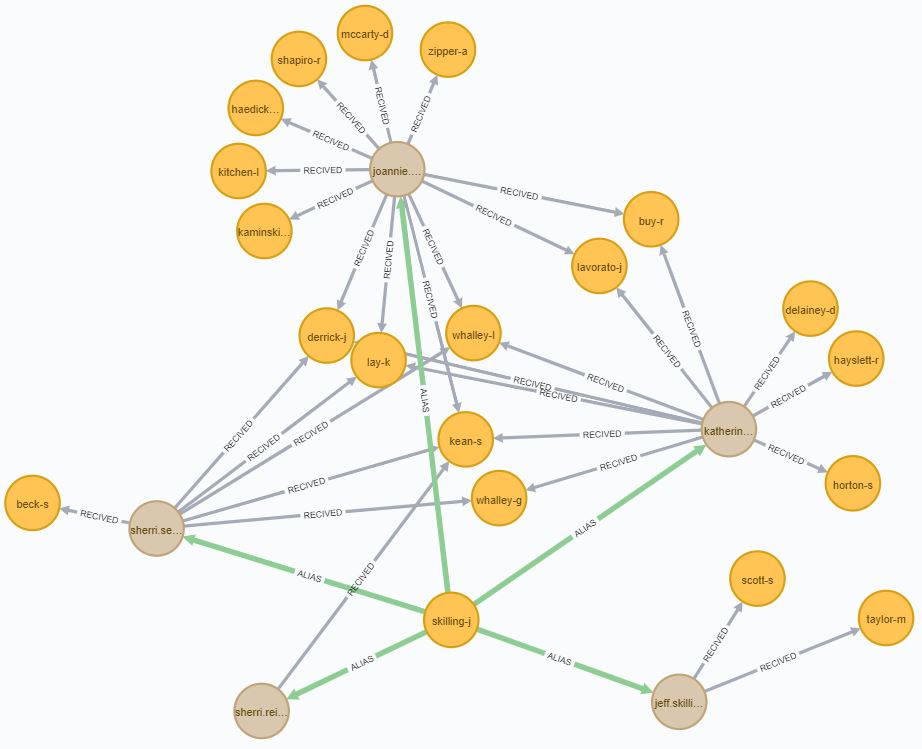
Extent of network
The extent of the network can be seen by the emails to which a user communicates with and is reciprocated, or simply put, email addresses of which interactions have taken place. It was noted earlier on that users for some reason have multiple email addresses. We have ‘fixed’ this issue through a series of logical checks such as identifying ‘From’ email addresses within the sent folder and the frequency of which that particular email address appears in the outbox.
The following screenshots are pulled from a ipynb file with a javascript plugin that helps bring neo4j visualizations to Jupyter notebooks source
NOTE: edits were made to the vis.py file to pull specific Cypher queries that met my requirements. Otherwise, the script calls the entire database.
Links are constructed using py2neo into HTML. Screenshots were directly from Neo4J Desktop.
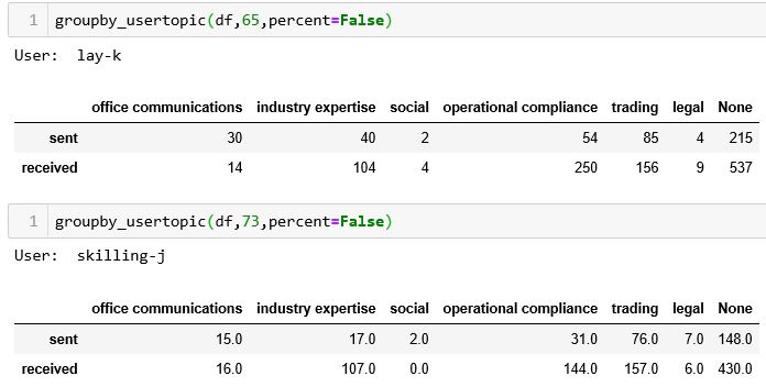
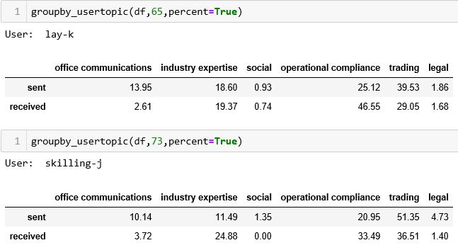
Total Sent/Received by email/users by topic
This is a simple query that pulled all emails sent and received by topic by person. As a raw statistic on its own it may not be entirely useful and would be great to have it as a comparison against others.
This shows the count of emails sent and received by topic by skilling and ken-lay. While the 2nd image shows the percentage of emails transacted. As we know, percentage on its own can be misleading if not supported by raw values. However, while this may illustrate the overall position of thee individuals on these particular topics, we would need to examine how these topics by these individuals evolve over time.
Topic count by user
Topic Percentages by user
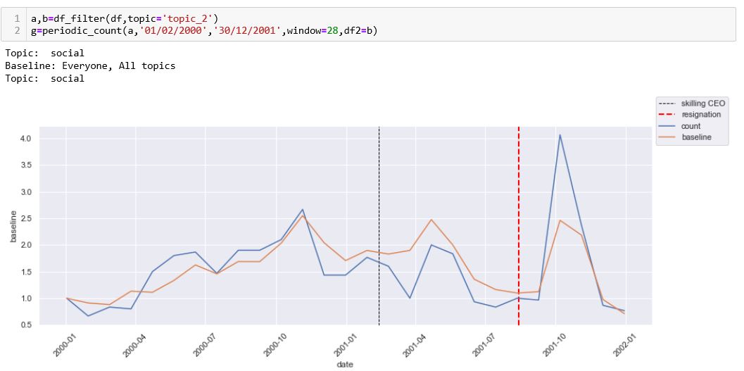
Topics by person over time
I have normalized the number of total emails received and sent by each user over time (from the start date that is) and have created benchmarks for comparison. In this case, when we are looking at a user by topic, it would be good to be able to see how that topic as a whole is being discussed over time.
The following 2 charts are for Kenneth Lay.
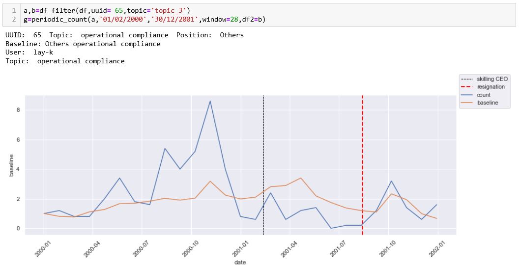
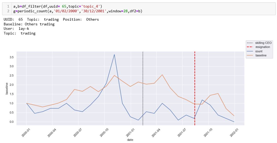
Due to the spikes in conversations prior to the appointment of skilling as CEO, it is a little difficult to observe any significant difference, however, if we were to drill down to the period where skilling was appointed, for the most, 2001. We observe Kenneth’s conversations on compliance is deteriorating, along with the rest of the company. Where as on the topic of trading, he appears to have kept it stable where the company is acting otherwise.
The following 2 charts are for Skilling-j.
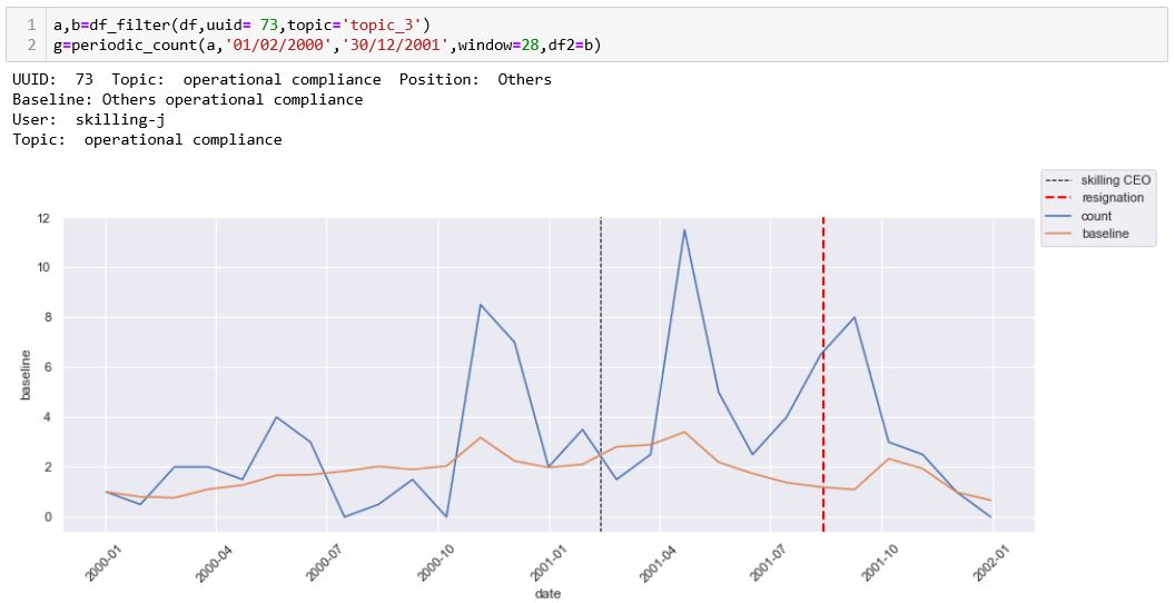
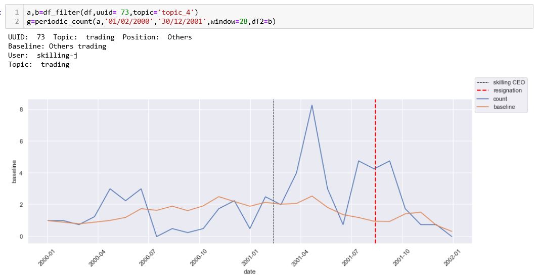
We can tell that for the case of skilling there is an uptick in addressing ‘compliance issues’ when he became CEO. This is much unlike what his peers are doing at that point in time wherein it is roughly stagnant. At the same time, we have suddenly seen an upshot in enthusiasm when it came to dealing with trading and deals when he became CEO. Isolated we may not necessarily figure out any issues. However, this combination of topics in tandem is expected. As more deal operations require more compliance requirements.
Conclusion.
While we were not necessarily able to identify fraud in this particular case, we have the makings of identifying issues that may arise as a result of tracking topics over time. For the case of skilling for instance, further examination would need to be done to identify if the increase in compliance topics is positive or negative. Hindsight is 20:20 and as we know, it is likely the latter. However, just as likely, we could have noticed a decline in compliance like the case of Kenneth Lay. This could suggest deteriorating circumstances in a particular area.
Even through this simple exercise of what I would deem as very rough topic modelling, we can observe various trends, both on a company level - by community, and on an individual level, where their actions over time, when traced, is able to tell us a story of what may be going on in various areas of the business.
Oh and here is the graph for social calls.. rather interesting it all came as everything went down..